
At the first Amiga Technologies GmbH press conference, several pictures of a new design for an Amiga tower case were released. The design had a small `beehive'-like logo which was obviously intended as a new symbol for the Amiga.
When these pictures were distributed on the Internet, much dicussion ensued on the Amiga-related Usenet newsgroups. In general, people liked the design of the tower case but were unsure about the small triangular logo.
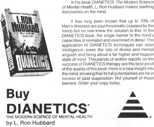
A few weeks after seeing the pictures of the new tower case design, I came across a flyer for L. Ron Hubbard's book `Dianetics'. Hubbard founded a religion called Scientology many years ago, and in recent years it has gotten a lot of bad press and has been accused of being a cult.
Aware of this, I decided to scan the flyer in and post the following message to the Usenet newsgroup comp.sys.amiga.misc:
Path: broadcom.ie!not-for-mail
From: kj@broadcom.ie (Karl Jeacle)
Newsgroups: comp.sys.amiga.misc
Subject: Scientology/Dianetics logo == Amiga Technologies logo
Date: 24 Jun 1995 16:57:29 -0000
Organization: Broadcom Eireann Research Ltd, Dublin, Ireland.
Lines: 442
Message-ID: <3shg5p$7qd@sylvie.broadcom.ie>
NNTP-Posting-Host: sylvie.broadcom.ie

I came across this flyer the other day for L. Ron Hubbard's Dianetics book
used by the Church of Scientology, and to my suprise found that the
Dianetics logo is the same as that of Amiga Techologies GmbH!

Attached below is a jpeg which I've tried to keep as small as possible (18Kb).
At the very bottom of the flyer in small print (not visible in jpeg), it
says: "DIANETICS and the DIANETICS Symbol are trademarks and servicemarks
owned by RTC and used with its permission". I don't know who RTC are.

I thought this was a pretty bizarre coincidence, and perhaps it means that
Amiga Technologies won't be able to use the "beehive" logo which so many
people have been complaining about.

Karl

-------8<-------------8<-------------8<------

begin 664 at-cos.jpg
                        [DELETED FOR CUGI ARTICLE]
end

-------8<-------------8<-------------8<------

--
Karl Jeacle       //
kj@broadcom.ie  \X/    http://www.broadcom.ie/~kj/
There were a number of replies to my posting. Some people were clearly concerned about any link being made between the Amiga and the Church of Scientology, while others (perhaps slightly misled) were saying things like ``Praise the Lord! The Amiga is saved!''.
A couple of days later, Dr Peter Kittel of Amiga Technologies GmbH posted this reply:
Path: broadcom.ie!ieunet!EU.net!howland.reston.ans.net!xlink.net!wega.fibronics.de!odb!ganesha!combo.adsp.sub.org!peterk
From: peterk@combo.adsp.sub.org (Dr. Peter Kittel)
Subject: Re: Scientology/Dianetics logo == Amiga Technologies logo
Newsgroups: comp.sys.amiga.misc
Reply-To: peterk@combo.ganesha.com
References: <3shg5p$7qd@sylvie.broadcom.ie>
Lines: 16
Message-ID: < peterk.0czi@combo.adsp.sub.org>
Date: 26 Jun 95 14:50:50 MEZ
Organization: Private Site

In article <3shg5p$7qd@sylvie.broadcom.ie> kj@broadcom.ie (Karl Jeacle) writes:
>I came across this flyer the other day for L. Ron Hubbard's Dianetics book
>used by the Church of Scientology, and to my suprise found that the
>Dianetics logo is the same as that of Amiga Techologies GmbH!

Shit. This is bad news.

>Attached below is a jpeg

Thank you for the effort.

--
Best Regards, Dr. Peter Kittel       //
Private Site in Frankfurt, Germany \X/  Email to: peterk@combo.ganesha.com
Now re-employed at Amiga Technologies GmbH in Bensheim, Germany
Stay cool, not cold (Cool bleiben, nicht kalt); H. J. Friedrichs
This was encouraging, perhaps the logo would be changed. It was still unclear, however, what the outcome would be. Was Peter Kittel thanking me for just bringing it to his attention or were there plans afoot to design a new logo? A few days passed, and another post from Dr Kittel answered the question:
Path: broadcom.ie!ieunet!EU.net!Germany.EU.net!nntp.gmd.de!nntp.darmstadt.gmd.de!news.th-darmstadt.de!odb!ganesha!combo.adsp.sub.org!peterk
From: peterk@combo.adsp.sub.org (Dr. Peter Kittel)
Subject: Re: simple questions yet to be answered
Newsgroups: comp.sys.amiga.misc
Reply-To: peterk@combo.ganesha.com
References: <19950626.7AE5568.12EA2@julian.slip.uwo.ca>
Lines: 99
Message-ID: < peterk.0da0@combo.adsp.sub.org>
Date: 29 Jun 95 19:48:13 MEZ
Organization: Private Site

In article <19950626.7AE5568.12EA2@julian.slip.uwo.ca> kadc@julian.slip.uwo.ca (Kevin Allan Donald Carter) writes:
>Here's some simple questions that I've yet to see answered officially:

                        [DELETED FOR CUGI ARTICLE]

>Logo
>----
>Has the prototype logo been accepted as final?

No. Now that we learnt that it's practically the Scientology logo, we
won't use it.

                        [DELETED FOR CUGI ARTICLE]

--
Best Regards, Dr. Peter Kittel       //
Private Site in Frankfurt, Germany \X/  Email to: peterk@combo.ganesha.com
Now re-employed at Amiga Technologies GmbH in Bensheim, Germany
Stay cool, not cold (Cool bleiben, nicht kalt); H. J. Friedrichs
How about that! From just stumbling across a logo that looked similar to the proposed Amiga logo, to a post from an Amiga Technologies employee stating that a new logo would have to be chosen...
So what would the new logo look like? A few days later and Gilles Bourdin, Amiga Technologies Press Officer, issued a press release which said:
The logo from Frogdesign has finally been chosen. It is a simple and elegant symbol that will from now on accompany the Amiga and its fans.
Frogdesign states about the brand : ``The Amiga Wordmark evokes both a classic and elegant feel as well as modern look. Bodoni, the font selected to build upon is a classic font. Further refinements involving the manipulation and substraction of serifs and the addition of the red square create a progressive, yet elegant logo. the red square represents technology and adds energy to the logo by implying a sense of motion.''
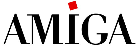
There have been mixed opinions about the new logo in the Amiga newsgroups. Many people feel that the original Amiga checkmark would have made the best logo, and that there was no need to design a new one. There was also criticism of how the new logo was created --- was it really necessary to employ a graphic design company to cut a few serifs off a Bodoni font?
Despite this comments, the Amiga Wordmark logo has been chosen as the definitive Amiga logo, and so we all just better get used to it.